Every January the trend lists land, and most of them read the same: a dozen looks, no point of view, nothing you can actually act on. So here's the opposite. These are the interior design trends genuinely shaping 2026 — and for each one, a straight answer on whether it's worth spending real money on or whether you should let it pass.
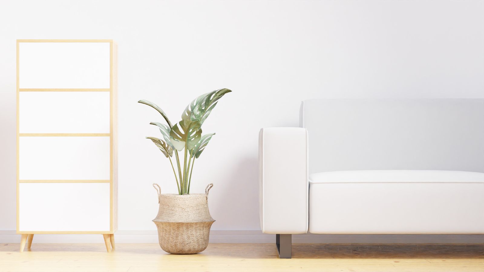
The big picture first: 2026 is the year the cold, grey, gallery-white look finally dies. After a decade of interiors designed to photograph well and live in badly, the whole industry is swinging toward warmth — natural materials, softer light, colour that comes back into the room instead of being scrubbed out of it.
Warm minimalism — worth it
This is the headline trend, and for once the hype is earned. Warm minimalism keeps minimalism's restraint — uncluttered surfaces, breathing room, nothing for the sake of it — but swaps the cold palette for oat, bone, clay and honey tones, and hard surfaces for tactile ones: linen, oak, wool, plaster.
The reason it works is simple: the old cold minimalism made rooms that looked great empty and felt clinical the moment you actually lived in them. Warm minimalism is built for staying, not for the photo.
Warm minimalism isn't "more stuff." It's the same restraint, aimed at comfort instead of a camera.
You don't need to gut a room to get there. Warmer textiles, a couple of real wood pieces, and paint one shade warmer than you think you need — that's most of the way.
Earthy colour — worth it
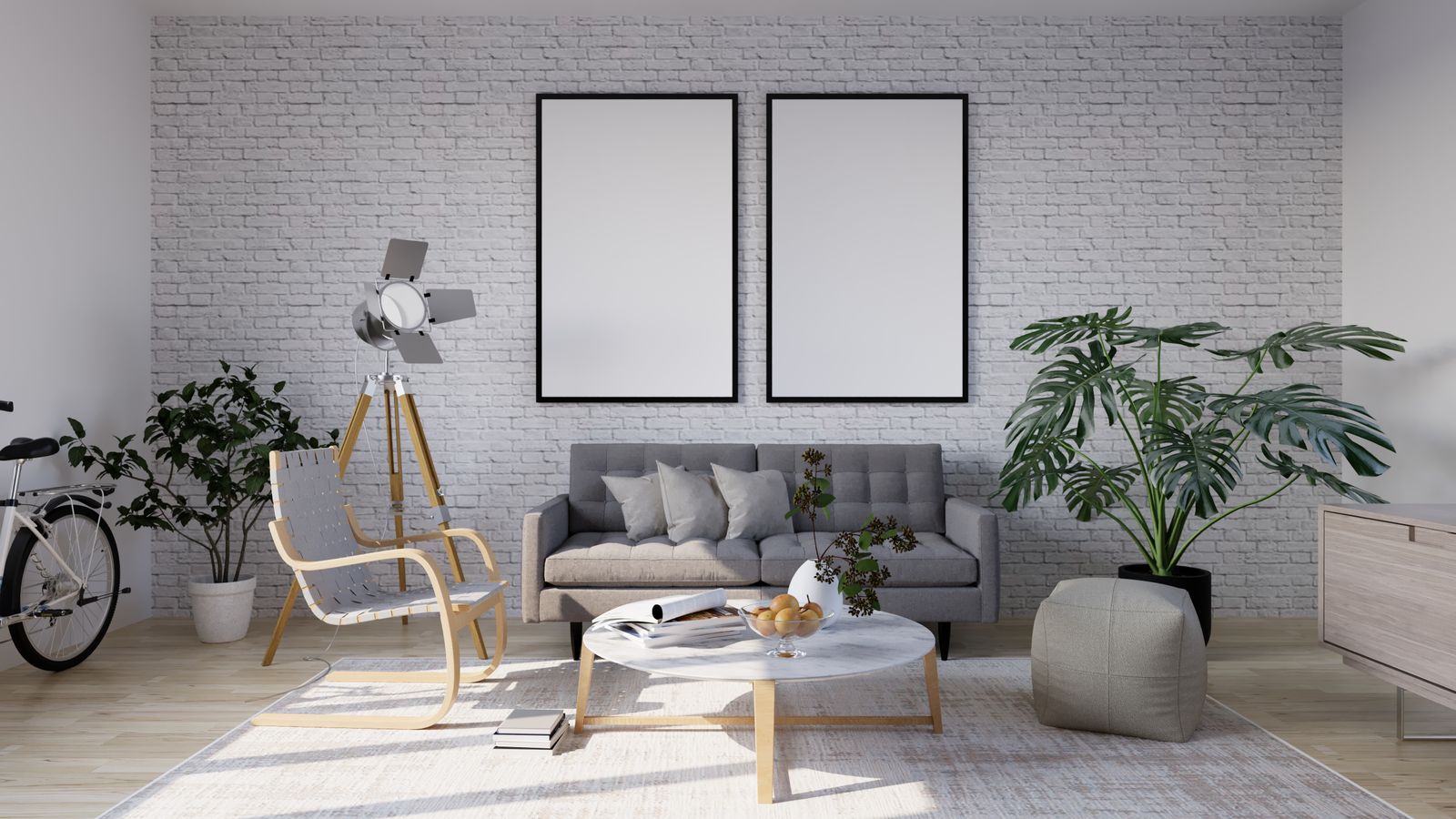
Grey is over. The colours doing the heavy lifting in 2026 are warm and grounded: terracotta, clay, caramel, mushroom, deep browns, and mineral tones like oxblood and warm teal. Even the paint brands are lined up behind it — warm mahoganies and eucalyptus greens are showing up as colours of the year across the board.
You don't have to commit your whole flat to it. The smart move is to keep the permanent, expensive stuff — floors, worktops, big upholstery — in warm neutrals, and layer the actual colour through things you can change later: cushions, throws, a rug, a single painted wall. We wrote a whole piece on how to use warm earthy colour without turning your home into a mud puddle.
Textured walls — worth it, with a caveat
Flat painted drywall is on the way out. Limewash, plaster, fluted wood panelling and slatted feature walls are everywhere in 2026, because a wall that has texture reads as considered in a way a flat one never does — and it changes as the light moves across it through the day.
The caveat: this is the trend people most often overdo. One textured wall in a room is architecture. Four is a theme park. Pick the wall that already gets the best light and stop there. More on which textures are actually worth doing here.
Curves and soft shapes — worth it in small doses
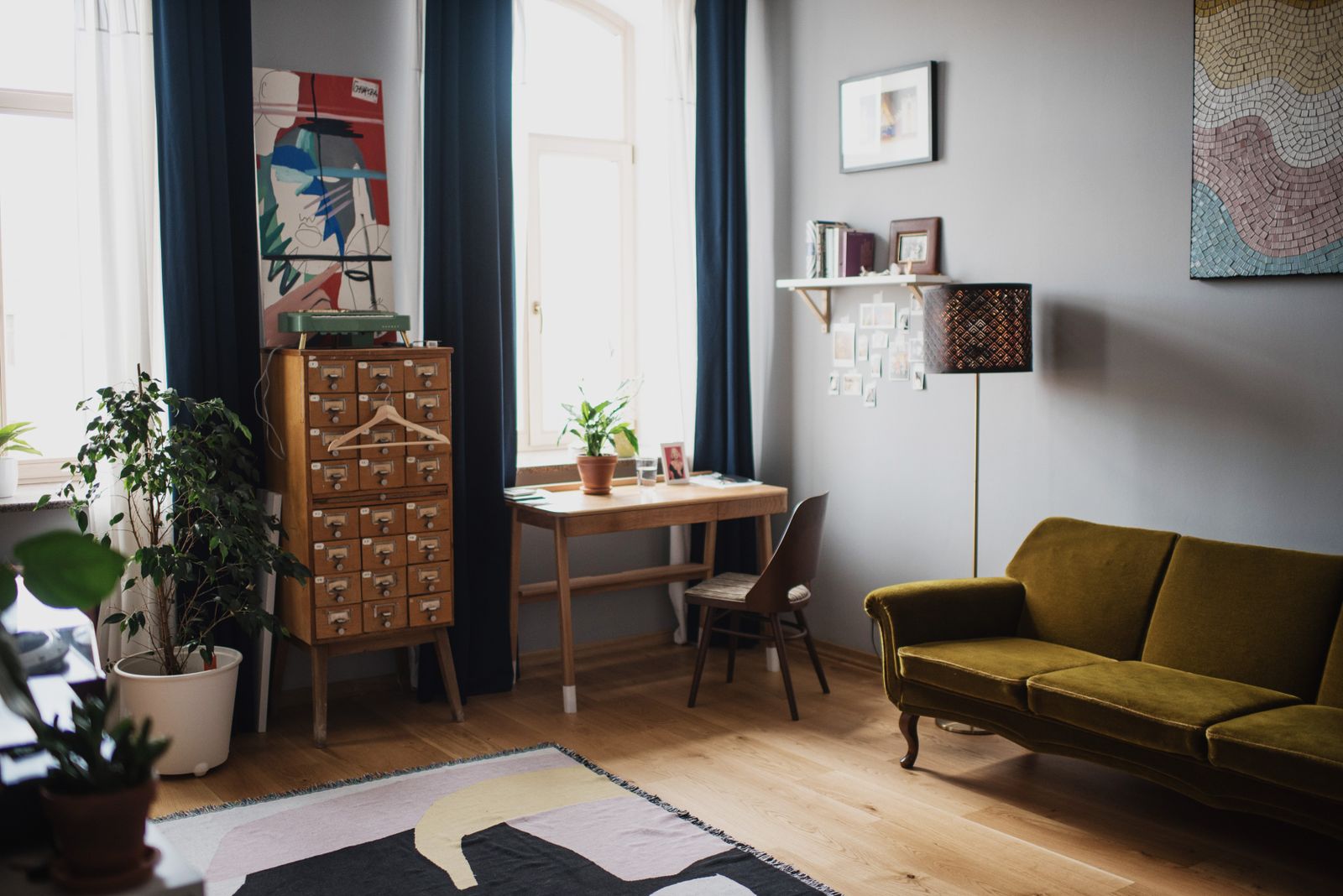
Rounded sofas, arched mirrors, kidney-shaped coffee tables, softened corners. Curves are genuinely having a moment, and a single curved piece does soften a boxy room beautifully. Just don't buy the whole set — a room where everything is round loses its structure and starts to feel like a soft-play area. One statement curve against otherwise clean lines is the whole trick.
Multifunctional furniture — worth it (and not going anywhere)
This one isn't really a "trend" so much as a permanent shift, driven by smaller homes and rising rents. Sofa beds, extendable tables, storage ottomans, lift-top coffee tables. The mechanisms have quietly got much better, so a piece that does two jobs no longer looks like a compromise. If you live in an apartment, this is the most useful list on the page — we go deep on it here.
Overrated: the all-beige "quiet luxury" everything
Warm neutrals are great. A room where every single thing is the same shade of greige — walls, sofa, rug, art, curtains — is not "quiet luxury," it's just beige. The 2026 version of this look works because of contrast and texture, not because you removed every colour in the building. If your moodboard is one paint chip, add something.
Overrated: chasing the colour of the year
There is no single colour of the year for 2026 — the forecasters and paint brands all named different ones, from warm mahogany to teal to deep plum. That's your permission to ignore all of them. Pick the warm tone you actually want to live with. A colour you love beats a colour a committee picked, every time.
The honest takeaway
Do the warm materials. Do the earthy colour, layered smart. Do one textured wall and one curve. Buy furniture that earns its footprint. Skip the all-beige void and the colour-of-the-year panic.
And before you commit real money to any of it — the paint, the panelling, the big terracotta sofa — see it in your own actual room first. A trend that looks incredible in someone else's south-facing loft can fall completely flat in your north-facing flat. The only room that matters is yours. Try it free in RoomTourAI.
Photography via Pexels: dada _design, Paul Seling, Ksenia Chernaya.